This test pattern will help you adjust
your monitor for optimum viewing of images on this site.
Warning: If you have your monitor calibrated for your own purposes, do not make any adjustments to it here if you don't have digital controls and are unable to accurately return to it's previous settings. Remember to write down your previous settings if needed - I don't want to be the cause of any grief!
Calibration
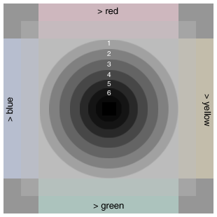
On your monitor, the background of this page, as well as the concentric rings and 4 corner squares of the test pattern should appear to be neutral shades of gray (no colour cast) - holding a white sheet of paper up to the monitor for comparison can help. The test pattern has 2 bars along each of the 4 sides that are tinted progressively toward the indicated colours. If your monitor has a "colour temperature" adjustment, set it so the gray areas appear as close to neutral as possible - usually somewhere between 6000K and 7500K is best. Each of the 6 marked rings should be easily distinguishable from the next. Just inside the 6th ring there is a darker circle and a totally black square within that circle. Adjust your monitor brightness and/or contrast until you have a nice even progression of shading towards black at the bullseye center and can see the slight colour tints (as labeled) near the edges of the chart. Adjust your monitor brightness up until the central square is easily visible, and then back down again until it just disappears. Note that some monitors may not have sufficient adjustment range to differentiate all the dark shades in the central part of this test chart.
Mike Mander, May
2004
[top] [main info page] [home]